Sunday, December 24, 2006

Type, Image and Message

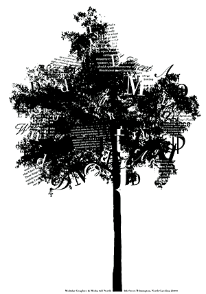
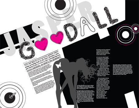
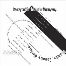
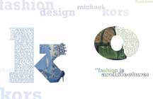
Graphic design is not just a combination of beautiful photographs and text because these are just basic tools for designers to present ideas. Therefore, it will be nothing if the combination do not create any meaning no matter what how beautiful it is. In fact, image and text should be two incomplete parts so that they are completed each other perfect.
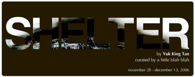
That is the challenge for designers to be playful with the combination of text and image. The position is also one of the important thing to think about because placing text and image in correct way can create meaning. There are four types for combination of text and image:
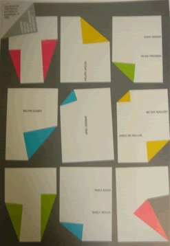
  • Separation: type and image operate in dependently

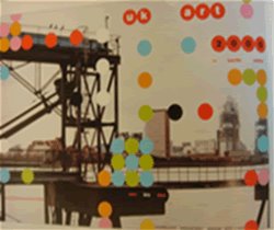
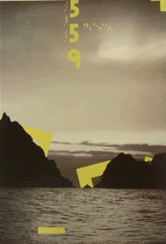
  • Fusion: type and image merge into one entity

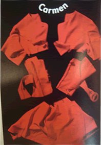
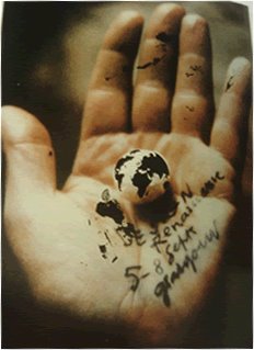
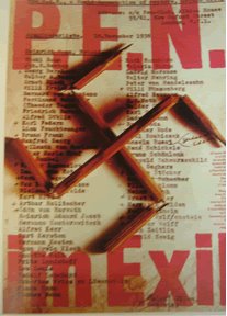
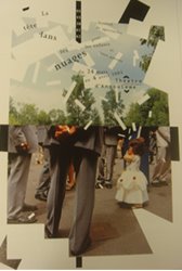
  • Fragmentation: type and image displace each other

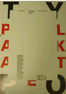
  • Inversion: type and image trade roles

Thursday, December 21, 2006

Typography

Tuesday, December 19, 2006

Book cover

Thursday, December 14, 2006

Festival of Lights.


From 8/12 to 11/12/2006 in Olde Town Conyers Georgia, there is a light festival with the purpose is to provide more information about lighting for outdoor environment. To talk about his festival, Britt Lee, vice president, said "The response from the professional designers and the community-at-large was tremendous. We tried something new this year by expanding the lighting exhibits to an actual streetscape for all to enjoy. It really celebrated the beauty and importance of lighting."

The festival included exhibition and lectures from lighting designers such as: Rogier van der Heide, a world-renowned architectural lighting designer, Michael Rohde, Leni Schwendinger, and Patrick Gallegos.

However, the spectacular show in this festival is the nighttime display. To prepare for the night show, twelve teams of lighting experts tried their best to illuminate buildings and public areas in Olde Town and each house and building was present in different style. By using different color of light, they lighted up the town with their talented. Audiences could walk along to enjoy the beauty of the light.

I still have the feeling like “wow” as I looked at some pictures of the festival. Designers made a really good job as using effect of lights to enhance the town. The changing in position created high contracts of light in nighttime to make audience feel a rhythm of light.

If you want to take a look at pictures of the festival, you can check it out at
http://www.festivaloflightsusa.com/PhotoGallery/Default.htm
http://www.dexigner.com/forum/index.php?showtopic=8602

Monday, December 11, 2006

Craft Bombing

Have you ever knitted a scarf not for person you love but for stop signs, door handle or even for the rocks?
You may think that it’s just a joke. However, you should think again because it is a real project that come from Knitta Please. This is a group of people who like knitting and want to use this skill to do something for their city.
Knitta Please open a small project about knitting crafts to cover steel bar and cement around the city. Like the cofounder of Knitta Please, Magda Sayeg said : “Everyone has a sweater or a scarf knit by a grandmother or an aunt. There’s something about the amount of work that goes into a piece that shows care. Knitting is an act of love.” Knitta Please also want to cover streets by their love through crafts.

Begin with that idea, now there are more than 250 feet of knitting that was made to cover the street signs, tones, or bridge lamp. It covers the cold color of steel and takes lot of attention from the public. It made people surprised a lot as they looked at colorful crafts around simple things on the street.

I love this idea because it shows the effort of these people who try to do something for their city. Although, the idea is simple and funny, it brought a new look for crowed streets in modern city. It also sent a message to the public that they should hold on a second to know about life and what happened around them, something that they can pass by without any notice.
Besides, as touching warm hand- made crafts instead of feeling cold surface of steel, it will bring the feeling like you are home.

You can have a look at to get more information about this project
http://www.knittaplease.com
http://www.metropolismag.com/cda/story.php?artid=2337

Sunday, December 10, 2006

Yuk King Tan and her “Shelter”


I came to gallery Quynh yesterday with some of my friends and get a chance to know about “Shelter” of a New Zealand’s artist: Yuk King Tan.
At a first look, I was impressive by these paintings. I thought these are paintings in Chinese styles in the ancient time when people drew by dark ink. However, I was wrong. The black background was made by smoke instead of ink. This makes me more interesting in these paintings.

The “Shelter” shows the powerful as Yuk King Tan combined smoke and the line art together. It somehow likes the combination of text and image in design. Although the image itself is very powerful, it’s still incomplete and text will play the role as the missing part to make the image more meaningful and more powerful. That works the same for smoke background. It is very strange and attractive but there is no meaning if it just stands alone. Combination with small drawings will give these backgrounds a role to delight the whole image.

Saturday, December 09, 2006

Design, Puppies, and Love


Nasir and Nargis Kassamali, the renowned Lumainire stores in Miami and Chicago, have opened a project in this winter. The project was made for charity purpose with the will to increase the funds for University of Miami Sylvester Comprehensive Cancer Center.

In this project, designers will face a challenge to turn the minimalist plastic dog of Eero Arnio into an object of desire. They have to try their best to enhance the dogs to sell these at an action in this December. The charity auction will be conducted by Christie with the help of Kassamialis and their supporters. They hope that what they are doing can give a hand for the processing of cancer research.

In this auction, there are about 30 puppies that are created by 36 artists, architectures and designers around the world. Each puppy in the auction is very attractive not only because of its design, but also because of its meaning. Design puppies, in this project, do not mean you just create something. It means you design the shape of love. Moreover, the puppies are not just a toy. It’s a love messages that come from designers to people. This makes the work become more worth than ever.

I know that in this winter the cold wind will be shine by the love that comes under the shape of puppies. This may become the most wanted gifts in Christmas this year.

If you want to have more information about this project, you can find it out at this website:
http://luminaire.com/flash_ui/fs_interface.html
http://www.metropolismag.com/cda/story.php?artid=2398

Friday, December 08, 2006

The METROPOLIS View : 25 Years Through the Lens


During 25 years, Metropolis magazine was being considered as a trusted source for designers because of critical point and article about art, architecture, product design, and graphic design. It was a part in designer’s life and design community.

Now, to celebrate the 25th year of publishing, Metropolis Magazine opened an exhibition to show the work of 25 award-winning photographers who took attractive image that plays a part in the success of the magazine.

Susan S. Szenasy , the editor in chief for 20 year, said "Over those 25 years, we've seen the public awareness of design grow from almost insignificant to fundamental,". She adds: "Our photographers have made a major contribution toward our ability to present the designed environment from humanist point of view-in dramatic overviews as well as in close-up details and every scale in between. We are thrilled to share our success with them at the upcoming show."

The work of Robert Polidori, Sylvia Plachy, Paul Warchol, Sean Hemmerle, Kristine Larsen, Lara Swimmer, Todd Hido, David Allee, Julius Shulman, Jimmy Cohrssen, Timothy Hursley, and Tony Law will be present in the exhibition. The exhibition was played in the Miami Design District, on December 7-10, 2006.

This is some of images in the exhibition:


Sunday, December 03, 2006

Websites for book cover.

Design a book cover is not a simple thing to do. It requires many skills to make the covers both related to content and attractive. It is a challenge for designers to arrange the text and image on the cover to present for the book itself. Therefore, the first things before making layout is taking a look at some others work to get more idea about how to design a good cover page.

The first website I found out is:
http://www.ragandboneshop.com/bookcovers.htm
It’s a web for book shop named “Rag and Bone”. It has some impressive book covers that were made by Mark Lerner, a graphic designer. Besides, the web also shows you some of book interiors.

After take a look at book cover of a graphic designer, I would like to introduce to a website that will show the work of design students in St. Francis University.
http://www.stfrancis.edu/va/designgal/
In this website, you can take a look not only at book covers, but at CD cover, magazine layout and poster...ect.


These two webs about have showed you the style for book cover of West side, now I will give you a website for cover book that has the style of East side. http://www.nagahara.gr.jp/bookdesign/93_87.html
This is web that shows Japan styles in book cover. You can compare and feel the different in style of Japanese. Besides, the books are arranged by years from 1987 to 2003 and as following the time, you can see how the styles slowly change.

Friday, December 01, 2006

Sai Gon Open City _ Design’s mistakes:

Sai Gon Open City has been opened and managed by a group of artists and designers and it is true that Sai Gon Open City has some weak points that I prefer to call mistakes of design. Among mistakes such as licensing, organization, fund, technical and artist, I personally think that the lack of communication is the biggest mistake. This came not only from Sai Gon Open City side but also from others and the lack of communication also caused other troubles. It is said that just with the word “IF”; you can put Paris in a bottle. However, let’s use it to solve this mistake.


From the point of view of Sai Gon Open City, they did not get any support from the authority of the city and that lead to problem about the licensing and the late in the exhibition. However, from the point of view of authority, because they did not understand the meaning or purpose of the project, they did not approve or support for Sai Gon Open City. They could not do something that they were not interesting in. If organizers of Sai Gon Open City had made a good communication and contact with authority in the city, there would have had trouble about the licensing.

The same mistake happened with artists before 1975. If both Sai Gon Open City and these artists spent more time together to talk or discuss about the project, there might not have had troubles. Moreover, the quality of the project will be better because these artists who take a part in art’s history of the city, can give young artists advises.

This is just a start for Sai Gon Open City. They can solve their mistake by finding a better way to communicate with others. It may take time and patient is the only thing that will make thing work in this time.