Thursday, November 30, 2006

Book Cover Page


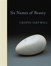
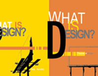
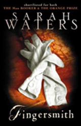
These are 3 book covers that I like as I took a look around.

For the book Fingersmith, black and the yellow colour were used to present the story’s time inside which is the Victorian Era in England. Besides, the image of a pair white glove is contrast with the background that is the reason the book takes the attention from the buyers. Moreover, a pair of glove also plays an important role in the story. That means that designers for this book already read through the book to get the idea. In my opinion, I think this is a successful cover page because it can communicate with the buyer about the story and other detail about the writer, word type for the tittle are also place in right place.

Other books are design books that is very impressive with the arrange information and image.
Friday, November 24, 2006

Knowledge of Designers

In my opinion, designers not only need to be creative but also need to have a good knowledge because it will be a foundation for their house of creativity. Besides, improving knowledge also shows responsibility for their work and for what they created.
There are many ways to improve knowledge but in my opinion, reading is one of the best ways. Through books, you can learn many things from other works and experiences.

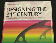
Now, as talking about books, let’s me introduce a book that I has just read recently.

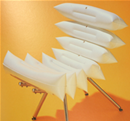
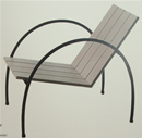
In this book, you can experience from other designers’ works, thoughts and the way they present their ideas by combination thing. It is very surprise that a chair or a lamp can be presented in various ways.

Saturday, November 18, 2006

Non-liner in movie

Non-liner is the way that stories are presented by not following time order. It means that stories’ time will be rearranged. Therefore, a movie can start at the end or in the middle of the story. This way can make the audience confused but also can get attention from them because they have to pay attention and try to figure out what will happen next


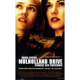
David Lynch’s movies can be good examples. Most of his work is very confused and difficult to understand at first. The atmosphere in his movie makes audiences feel like they are in a dream. Everything, even the light, the music, color and the way he arrange things in strange way make people confused. However, this is the attraction for his movies such as Mulholland Dr.


This movie is divined into 2 parts. The first part which audiences thought is true is just a dream and imagination. It is totally different from the second part which is actually the reality. That makes audiences really more confused in what they had seen before because what they think true now become unreal. The sudden changing makes they lost their ability to realize. That is also the attractive styles of the director. He used successfully non-liner in his movies to make it has their own style and become more attractive.

Reference:
The New York Time 2006, “David Lynch”, viewed on 18 November 2006, http://movies2.nytimes.com/gst/movies/filmography.html?p_id=100454&mod=bio

Picture links:
http://davidlynch.ifrance.com/dl.htm
http://www.amazon.com/exec/obidos/tg/detail/-/B00005U51F?v=glance

Saturday, November 11, 2006

Composition

The left


The right


There are two picture that I took before. I think it will be a good example for Composition

Wednesday, November 08, 2006

Flyer exercise


Wednesday, November 01, 2006

Abstract with Photoshop

The original picture:

The link of the picture


After